Commissioned and published work
I have successfully completed many commissions, ranging from family portraits and personal works (rendered in my style but guided by the client) to book illustrations, dust covers and posters. Below are some examples of past commissions. I gladly accept commissions for private artworks and illustrations and designs for published texts, book covers, posters and CD/DVD covers.
Please contact me via e-mail at [email protected] or via WhatsApp on +27 83 540 0579 to discuss your requirements.
Please contact me via e-mail at [email protected] or via WhatsApp on +27 83 540 0579 to discuss your requirements.
Private commissions
Many people have commissioned personal works from me. I have often been asked to paint portraits of family and pets, but with a difference - not the normal, static "sitter's pose", but rather in my style, allowing me to be creative in the interpretation. This is done in close collaboration with the client.
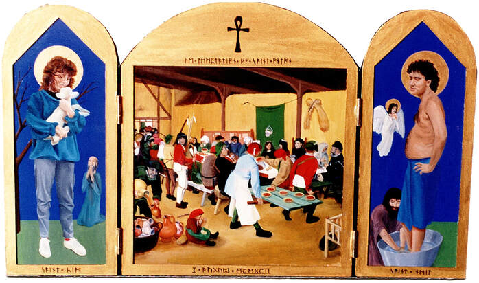
"The Davidson Alteredpiece", oil and gilt dust on oak panels, 44 x 36 cm (opened). I painted this in 1992 to celebrate the wedding of two of my friends. The centre panel is a parody of Breugel the Elder's famous wedding scene, "Peasant Wedding Feast" from 1567/8. The faces of people who were at my friends' wedding reception are painted onto the various characters in the scene. The side panels depict the couple in the style of saints in medieval paintings.
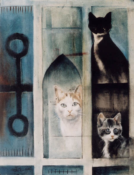
"Kathy's cats", oil on canvas, 2001. I was commissioned by their owner to paint a portrait of three cats, with a fair degree of artistic freedom. Since herding cats is not one of my superpowers, I painted each of my sitters separately and wove the portraits together with an abstract suggestion of architecture.
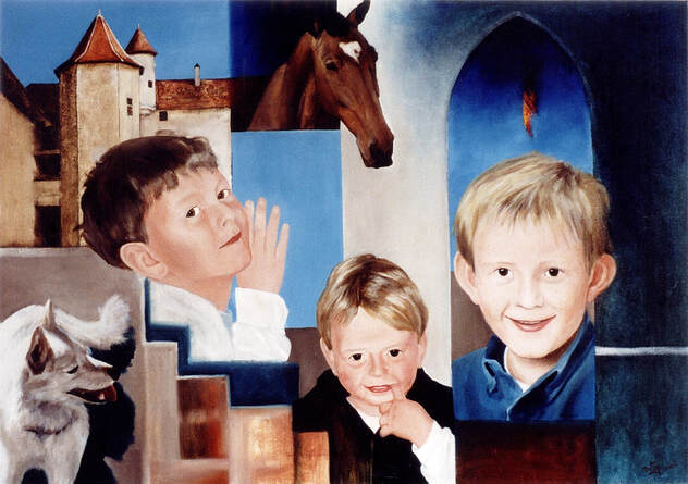
"Le Plessac", oil on canvas, 100 x 70 cm. This work was commissioned by a family living in an old castle in the Dordogne region of France, while I was on an art residency at the Cite Internationale des Arts in Paris in 2002. I was asked to include their three sons, the castle, a favourite horse and the family dog, but without it being "just a portrait".
|
|
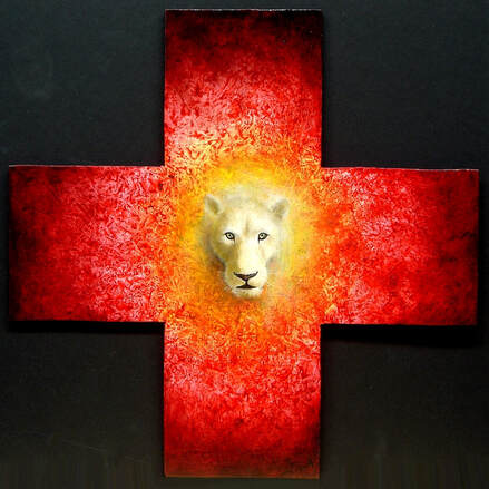
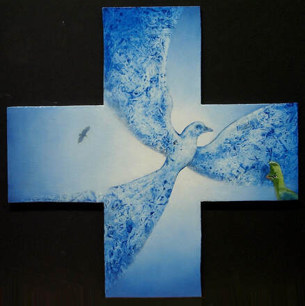
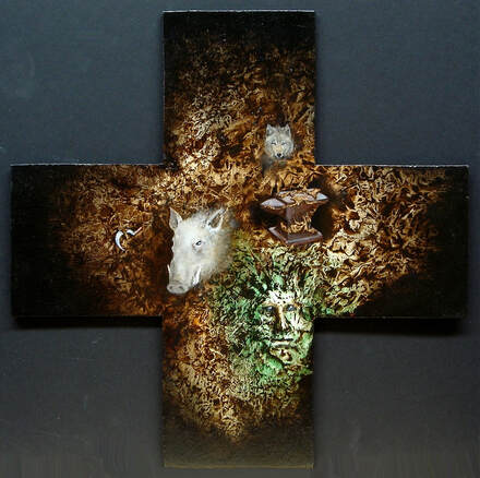
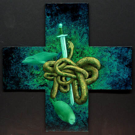
"Cardinal elements" : clockwise from top left "East - Fire", "North - Earth", "West - Air" and "South - Water" ; oil on board, 4 panels each 30 x 30 cm. This set was commissioned for a circular upstairs room with views in the four cardinal directions. The client also wanted these to correspond to the four classical elements of Earth, Fire, Air and Water. Where the house is situated, to the East is where the sun rises, corresponding to Fire; to the North lies the whole continent of Africa, hence Earth; the West view was unimpeded by trees, so the open sky view inspired Air; and finally to the South lies the ocean, hence Water. Finally, symbolic animals and artifacts were woven into the compositions - these were specified by the client as being of personal or family significance.
Published work
Andre Brink - Sandkastele
I produced work on commission for several book covers for my father, author Andre P Brink. Our first collaboration was on the cover of the Afrikaans, Dutch, French and Danish editions of his 1995 novel, Sandkastele (Imaginings of Sand was the English title). The brief was to create a painting or set of paintings that related to the story, which was centred around three generations of women and set in a 19th century "ostrich palace" of the type built by the newly wealthy ostrich barons of Oudtshoorn in South Africa, with peacocks roaming the grounds as a strong part of the image.
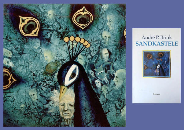
"Sandkastele 2", oil on board, 30 x 30 cm (left) was the illustration on the front cover of the Afrikaans edition. The dust cover appears on the right.
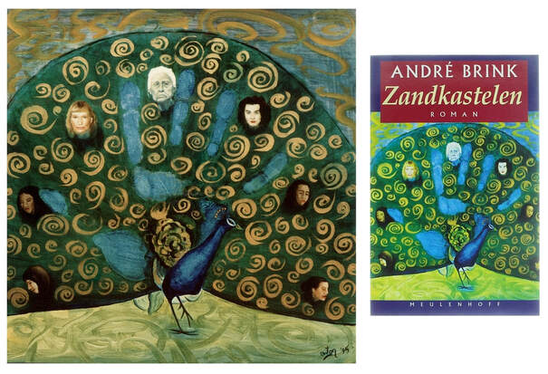
"Zandkastelen", oil on board, 30 x 30 cm (left) was used for the cover of the Dutch edition of the book, titled (of course) "Zandkastelen".
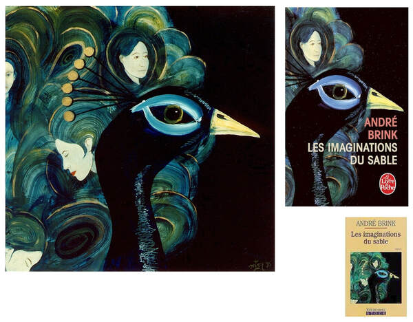
"Les imaginations du sable", oil on board, 30 x 30 cm, was featured on the front cover of two different editions of the French version of the same book. A very small reproduction of it also appeared on the back cover of the Afrikaans edition.
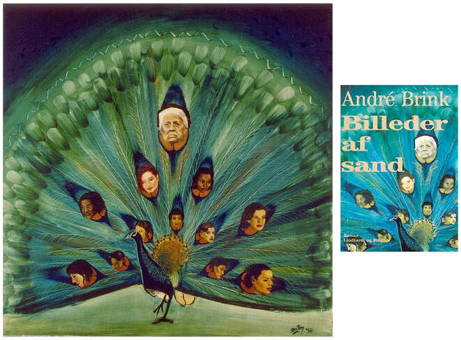
"Sandkastele 1", oil on board, 30 x 30 cm (left), and the cover of the Danish edition, "Billeder af Sand" (right). A small reproduction of this painting was also featured on the spine of Afrikaans edition.
Tony Eprile - Persistence of Memory
In 2004 I was approached by author Tony Eprile, who had seen my pastel and charcoal work, "Red", online and wished to use it as basis for the dust cover of his novel "Persistence of Memory".
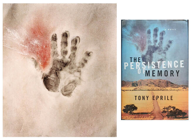
"Red", pastel and charcoal on paper, 32 x 38 cm (left) and the dust jacket of "Persistence of Memory" (right).
Anton Krueger - Sunnyside Sal
Writer Anton Krueger, whom I've known for many years, approached me for artworks that may be suitable to use for the cover of his 2010 novella, "Sunnyside Sal". My assemblage work, "The back seat" (subtitled "Are we nearly there yet?") was chosen as the perfect image for the story. This work, which I completed in 2005, was made from a rusty vintage car door found at a dump site outside the Karoo village of Nieu-Bethesda. The "window" consists of a painting (acrylic on canvas) of three pale faces on a dark background, set into resin with 3-dimensional trasparent cast faces superimposed over the ones in the painting as if they're pushing through liquid glass.
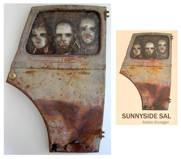
"The back seat", mixed media assemblage, 69 x 109 x 9 cm (left) and the cover of "Sunnyside Sal" (right).
Promotional material
Fishwives - In Fluorescence
My painting, "Broken mirror (Through the looking glass)", was used for all publicity related to the 2022 release of the music EP titled "In Fluorescence" by the Fishwives, a South African progressive-folk band playing original music and with whom I play fretless bass guitar. The publicity material included CD covers, posters, fliers and all online promotions. I painted "Broken mirror" in 2021 using techniques that I have developed over many years, to create unusual works exploring the subconscious. The image resonated so well with all that the Fishwives represent in their music and in their personae that when the time came to find a suitable image to promote the new release, we were all unanimous in deciding that this was the one.
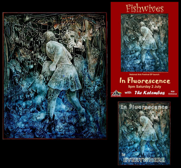
"Broken mirror (Through the looking glass)" (oil on board, 100 x 122 cm) was used for all publicity related to the band's EP release in 2022. Above right is the poster for the launch performance, below it is the logo used to promote the "In Fluorescence" EP on online streaming platforms.
The Tamagotchi Experience
Performance poster
Performance poster
The Tamagotchi Experience was an unusual progressive/folk band based in Grahamstown, with whom I played bass guitar. This is the poster from our last two performances in 2022, featuring my painting, "blurt", painted in 2011.
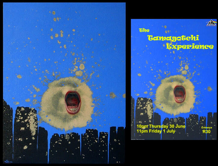
"blurt", oil on canvas, 36 x 46 cm (left) and the gig poster (right).
